AT&T decided to switch up their wireless plan options by allowing accounts with multiple phone lines to individually select which wireless plan made sense for each phone. Gone are the days where everyone was forced to share the same wireless plan. Not only was there a need to educate our users on this big mental model shift, but we also needed to create a new acquisition flow to easily support this type of construct and decision making.
Everyone can choose their own plan. It's that simple.
Overview
Opportunity
Win the market with a better digital experience allowing users to self-educate and empower the granularity they have been requesting so they can meet the needs of their family and monthly budget.
Research & Discovery
A comprehensive audit of our current acquisition experience and Verizon's in-market experience led us to identify the specific needs the new experience needed to account for, including:
1. Lack of familiarity led to confusion in learn stage
2. Plan names are confusing (multiple “Unlimited” plans)
3. Confusing discounts (save more with more lines)
4. Price changes throughout experience (loss of trust reduces user confidence)
5. Including different features with different wireless plans makes that decision confusing and time consuming
6. Missing details and confusing layout in "add a line" review page
7. Lengthy and confusing journey to change and obtain mix n match line specific information (Verizon bounced the user back and forth between pages)
Users seek context, guidance, and control to help them focus and move effortlessly through their purchase journey.
Solution
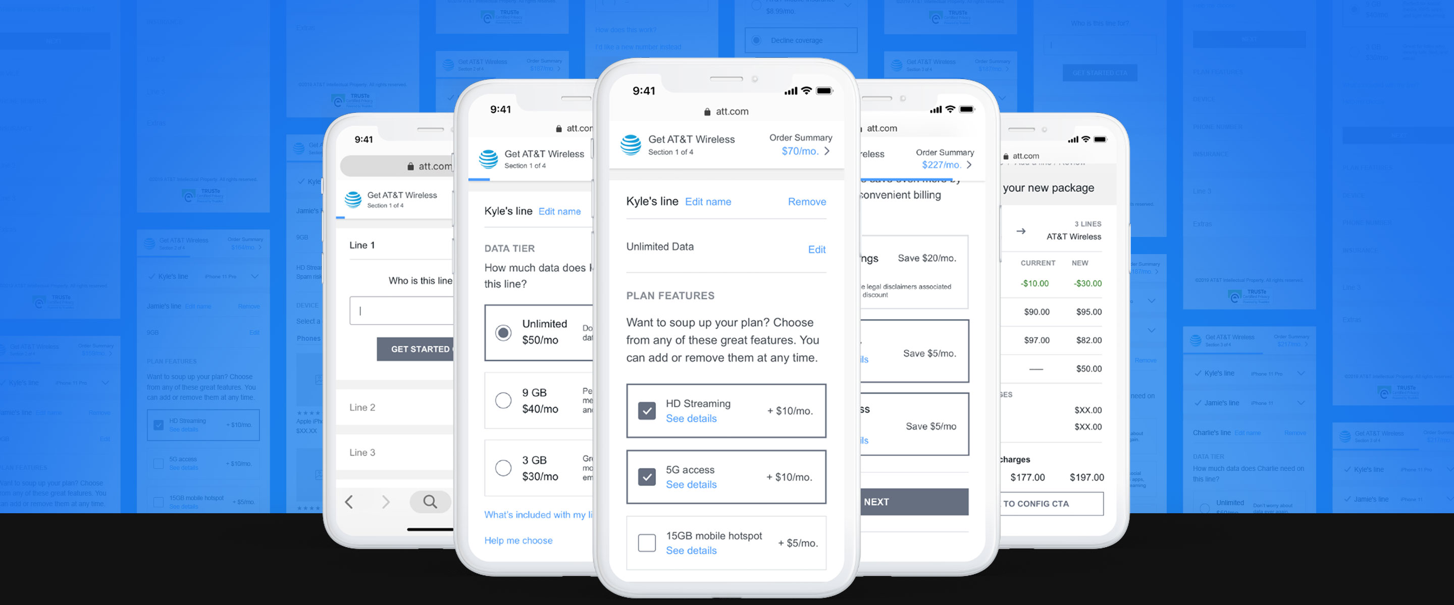
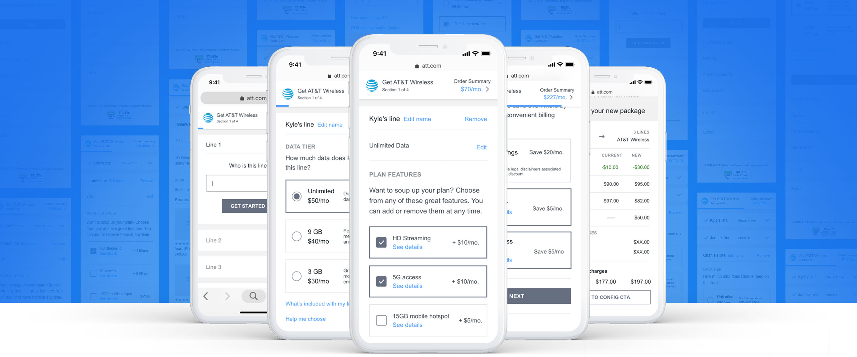
The framework needed to account for several different user types. 1). Net new customers switching from a previous provider. 2) Existing customers changing their plan to the new construct. 3). Existing customers adding a new line with an opportunity to change the previous lines into the new plan construct. The other variable to consider is the users entry point allowing them to start with a device in focus, or a wireless plan.
Learn Stage
For the Wireless Plans landing page, we focused on educating the users through multiple applications to enhance their familiarity with the change in order to reduce hesitations when making decisions further in their journey. Research showed users did not understand the term "Mix and Match" so we abstained from using marketing buzzwords in the copy and used simple, direct language such as "You can now add different data options to each line".
Real testimonials were included to help users understand the benefits of the new offering through the lens of real life situations, such as "I was paying too much money for my grandmothers plan when she only used 1GB of data per month".
We also offered a sample bill to help communicate the end result of the change to reduce surprises and further educate the potential customer.
And last but not least, we implemented a rich video educating the user on the benefits of how the new construct provided value to multi-line accounts.
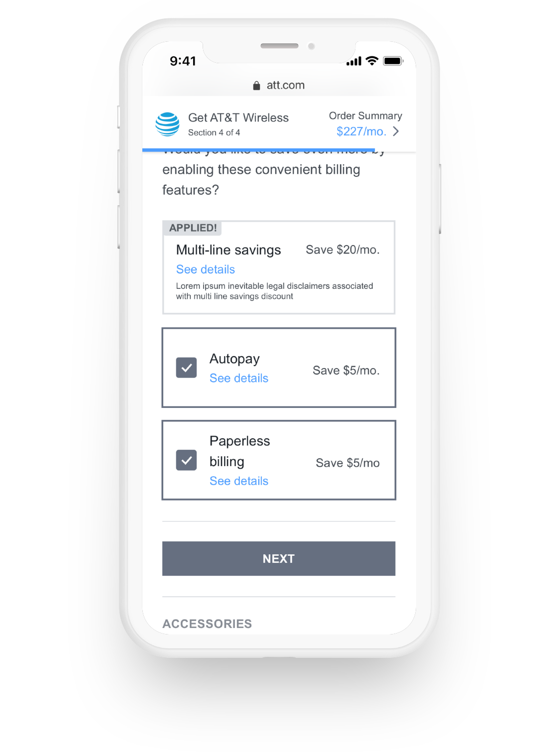
Simplified Pricing
We made a few strategic shifts to simplify the decision making process that tied back direction to customer pain points found in our research:
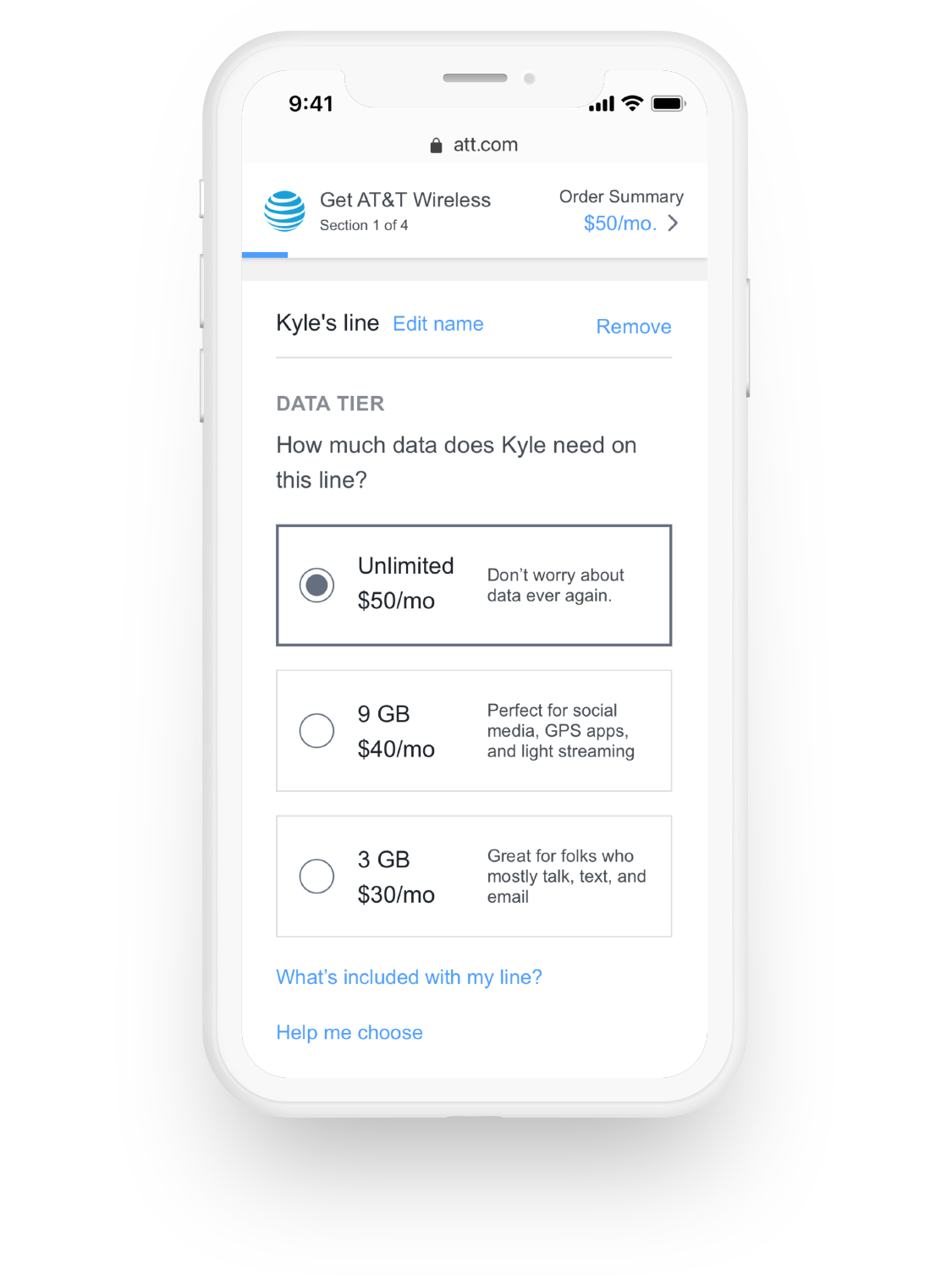
1. We simplified our plan offering to include only 1 unlimited plan (instead of multiple "unlimited plans")
2. Multi line discounts were not applied to the plan itself, but rather the entire bill so the pricing of our plans didn't change based on the number of lines you wanted
3. We included a limited number of features that came with every plan
4. We provided the rest of the features we offer in a la carte format
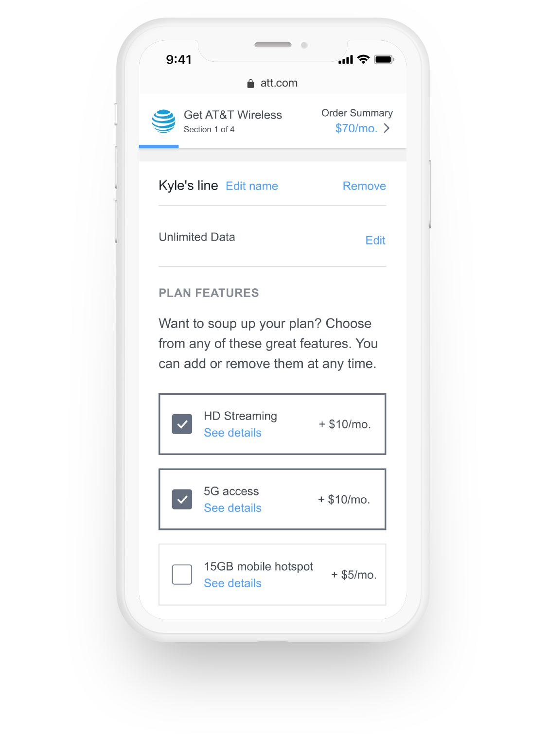
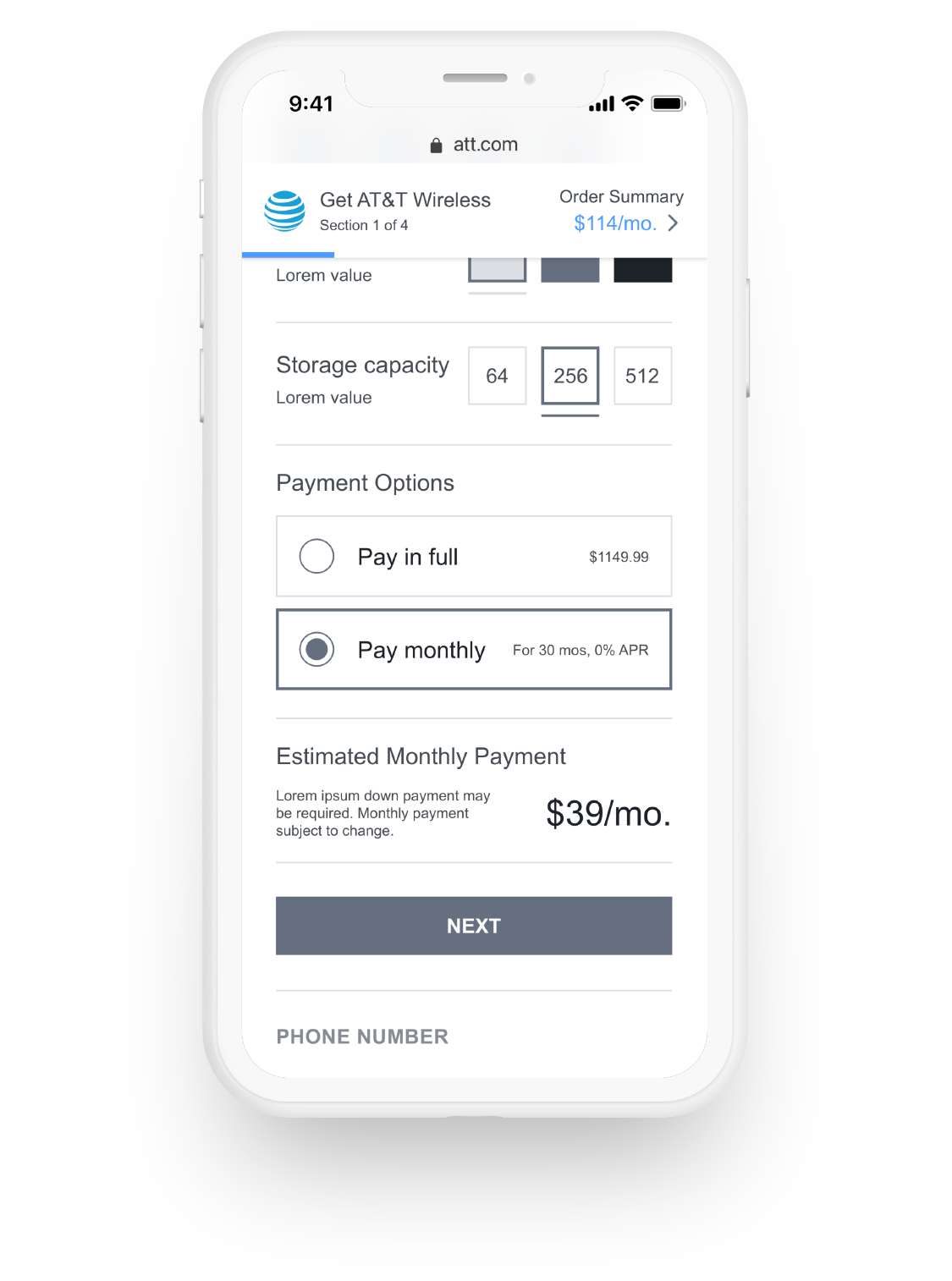
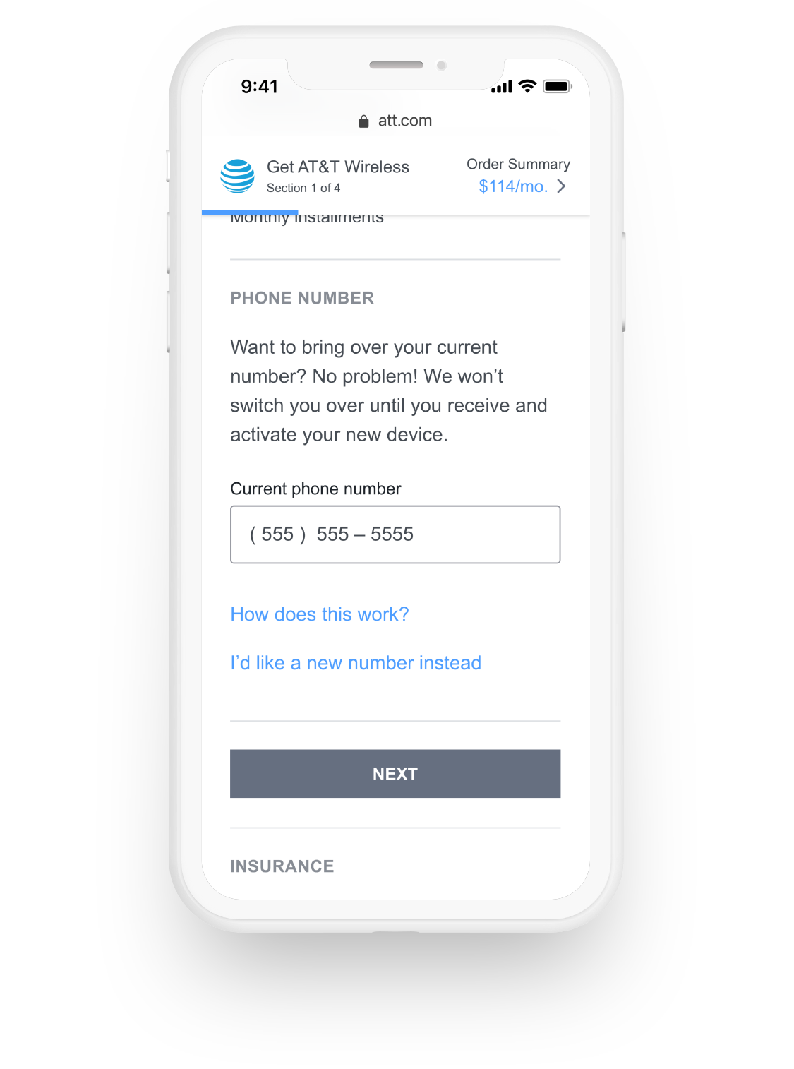
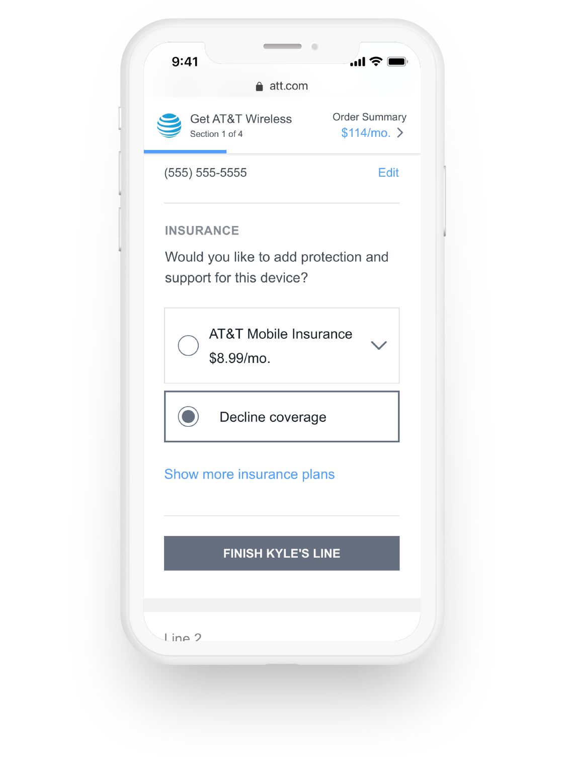
Buy Flow
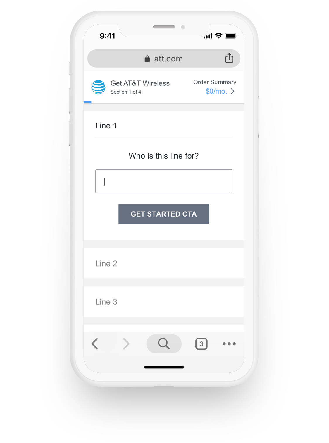
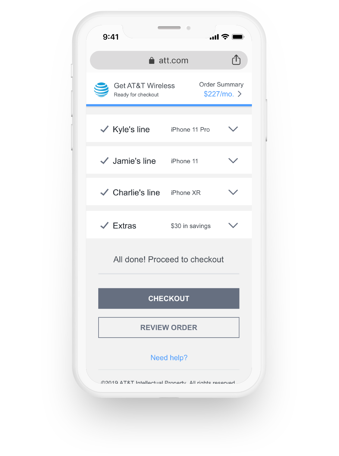
A strategic shift we made in our UX framework determined the parent grouping was per line, rather than selecting all plans first then moving to devices. To humanize the decision process, the first question we asked was "Who's line is this for?" to better frame the decisions that would come next (plan, phone, features, insurance, etc). This move also helped us on the account side allowing a clearer billing breakdown promoting the ability to easily split financial responsibilities.
A guided linear flow allowed focus and reduced cognitive load for our users. Each selection came with commonly asked questions that provided answers in a modal to reduce the need to bounce around to different pages keeping them focused on the task at hand and provide the information needed to make the current decision.
Context was also key and provided through a sticky progress element that also calculated money totals as you completed decisions for each line, allowing you to see a running total and how each decision affected the overall cost.
User Testing
By and large, our vision tested well. The most surprising revelation uncovered was that although users say they want a la carte features, they were surprised at the offering and in turn thought it was a money grubbing upsell and assumed most of the items should of been included with the plan already. This allowed us to better understand the threshold between what features should be included and what should be an additional cost.
Results
Our pre-work ultimately provided direction to our production experience resulting in a huge lift in several areas.