The pitch was to bring forth the same emotional experience Spotify creates with their music platform to our DIRECTV customers. Seeking brand affinity, customer retention, and a little something extra from your boring service provider.
Your personal connection with the entertainment world.
Overview
Opportunity
Become the first video company to create an emotional connection with your entertainment by revealing your personal watch habits through an engaging “choose your own path” user experience.
Research & Discovery
Since Spotify was our main source of inspiration we dug into their past efforts to note the opportunities that were “left on the table”. Spotify focused their experience in showing your data through unique categorization and beautiful animations and transitions with an opportunity to share who you are through music with your peers. This was rather successful and turned into a viral moment. I personally remember this dominating my digital space on every release.
As we thought of ways this experience could be improved, we noticed a few opportunities left on the table:
- testing your knowledge
- exploring geographic data
- quick hit scannable information
46% of people Binge Watched at least 3 shows this year. That's up 5,118% from last year. We blame Better Call Saul for the surge.
Content Strategy
With data and key art at our disposal, we knew finding unique connections was our golden ticket. We looked at interesting “moments'' throughout the year, customer behavior and building a sense of community for guidance. This led to questions in our quiz section such as:
What did you watch when everyone else was watching the super bowl?
What was the most watched show on Thanksgiving?
How many shows did you Binge Watch this year?
What was the most recorded show this year?
What feature would you like us to add next?
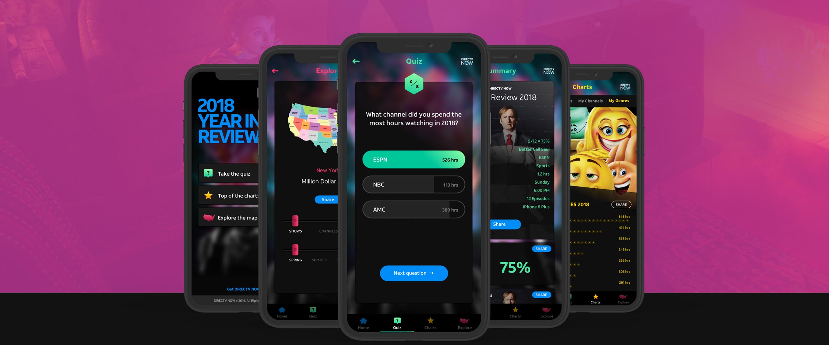
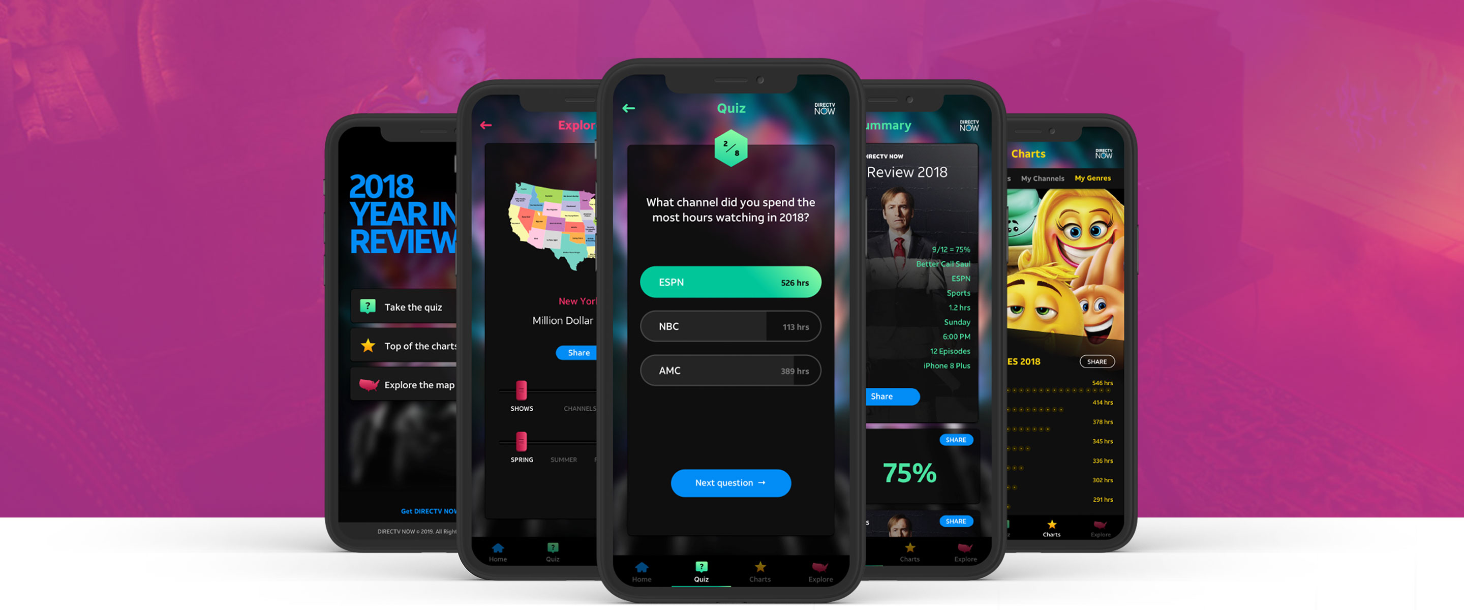
User Experience
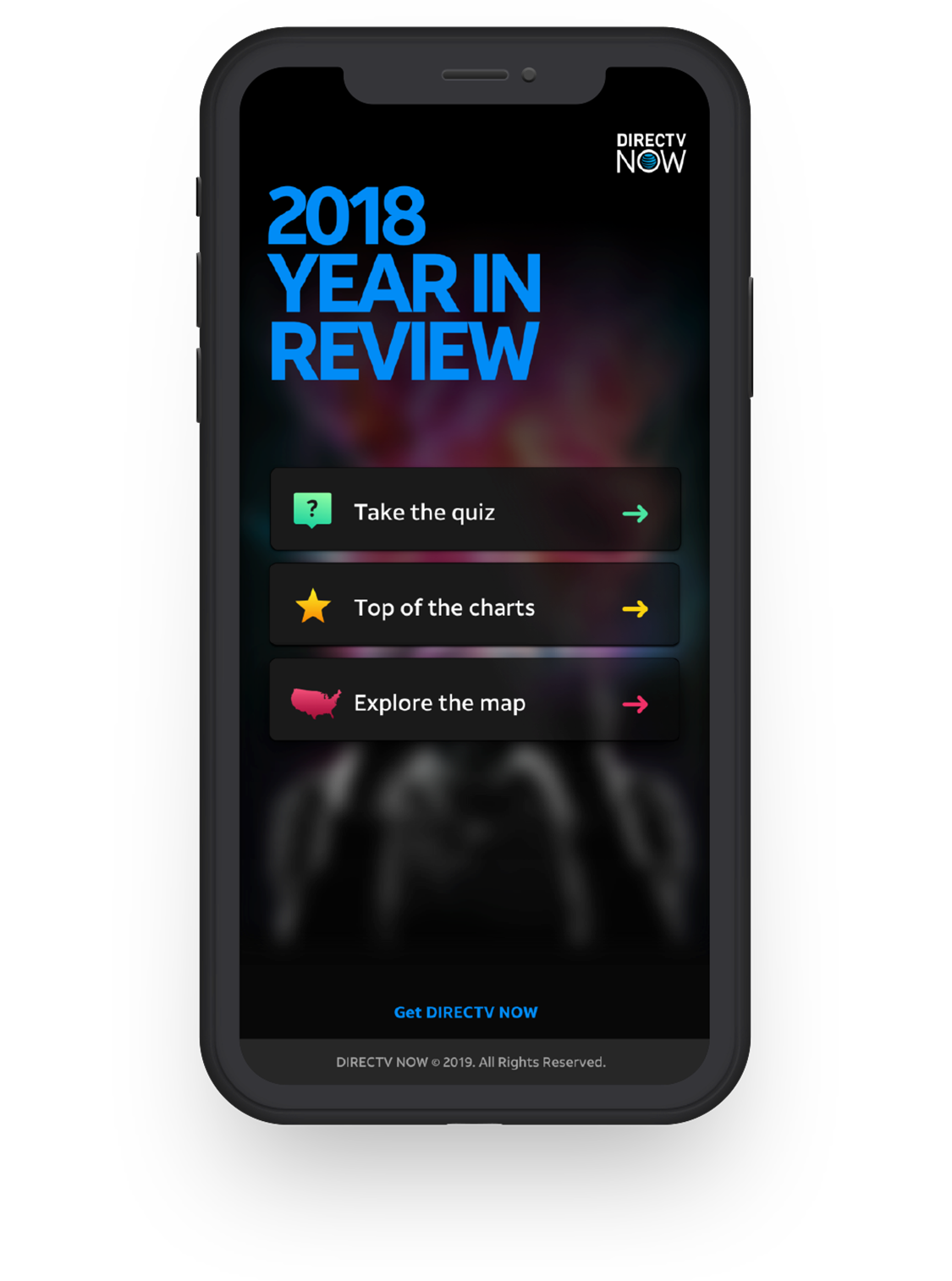
One thing we didn't love from the Spotify efforts was the liner fashion in which you were led down a singular path. We instead opted for a “choose your own path” experience from the start. You can take a quiz and test your knowledge, browse the charts with little effort, or explore trends through an interactive US map. Each layer provided a new way to learn and interact regardless if you are a paying customer or if you snooping around to satisfy an entertainment craving.
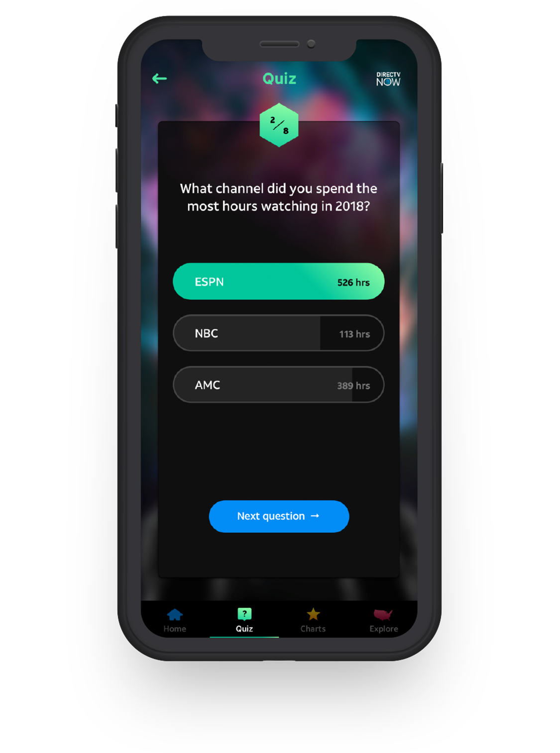
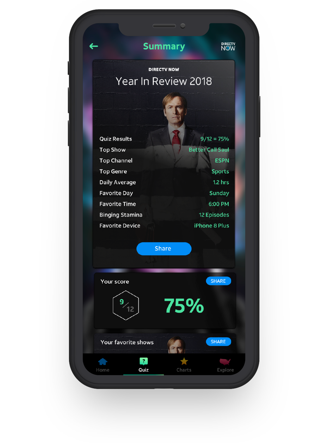
For our Quiz section, we took inspiration from the popular trivia game HQ which paid off big in usability testing. The framework provided an entertaining familiar experience. We also wanted people without DIRECTV to be able to participate so we created a quiz just for them so they didn't feel left out. At the end, we provided a summary with endless sharing opportunities that fed easily into your social network of choice regardless if you wanted to spill the beans or show some restraint.
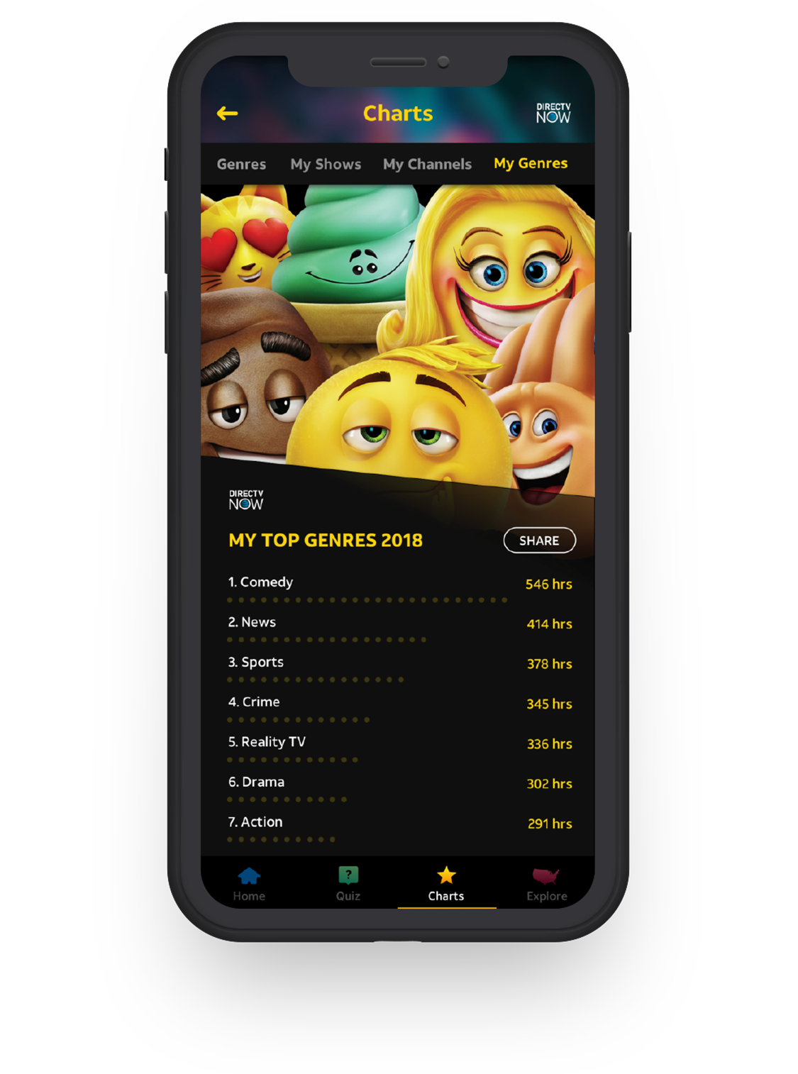
Those who wanted a quick hit could browse our top of the charts section. This area provides the top 10 shows, movies, channels, and genres with unique key art to celebrate the winner and data to further show just how far ahead of the pack they were.
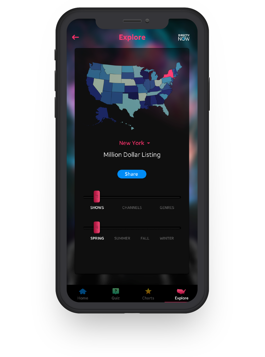
Our last section was for the explorer, who liked to see what people in other states prefer to watch. We offered a map view allowing you to filter by state, season, and content type. It made for great conversation among family and friends.